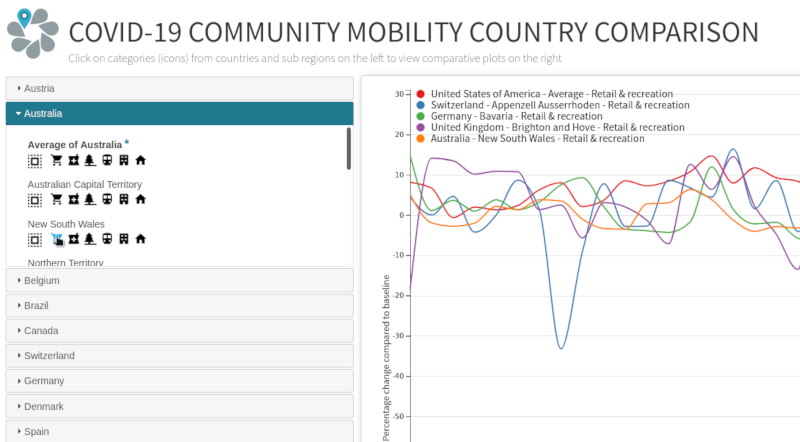
Following up on the last post, I put together a quick platform for comparing countries’ community mobility responses to COVID-19. Again, the data is based on Google’s PDF reports, but I thought a comparison visualization would be more useful than the static PDF files.