
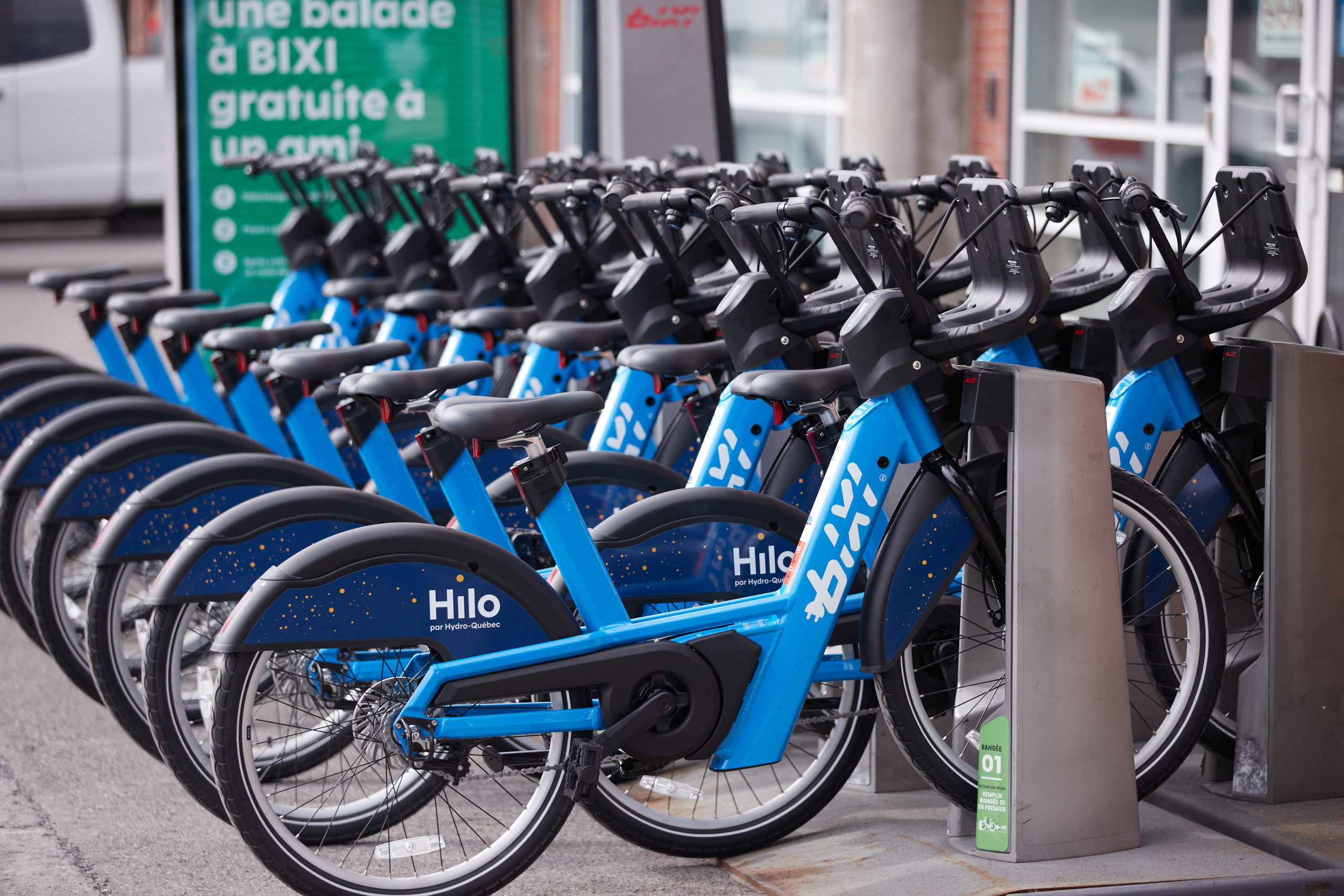
In the Fall of 2020, BIXI Montreal and the City of Montreal officially launched their first electric bike-sharing station. While BIXI had been testing these vehicles for quite some time, this was the company’s first major step into the world of electric bicycle sharing. This Spring (2021) BIXI ramped up their electric presence adding 725 new electric vehicles and 83 new electric stations to their fleet. Given our lab’s interest in micromobility, I thought it would be fun to do some data exploration.
First, we needed data. BIXI Montreal releases anonymized trip data at monthly and yearly intervals through their Open Data portal. While we are all very thankful for their support of open data initiatives, unfortunately the trip CSVs do not differentiate between trips taken on traditional bicycles and those using electric bicycles. So we had to do some digging. The BIXI website includes an interactive web map that provides real-time data about stations, including the number of available bicycles and free docks. Clicking on a specific station, we also find that this portal provides information on the number of e-bikes available, their identifiers, and their current battery charge. A quick inspection of the HTTP requests made by the web client shows us that all this data is provided as GeoJSON from the server. From here, we wrote a simple script that accesses these data and hooked it into a cron job that runs every 60 seconds. This provided us detailed information on the whereabouts of each e-bike at a 1-minute temporal resolution. Unfortunately, we didn’t start accessing the data until June 18th. Given that the BIXI will not release their July trip data until August, it means we have roughly 2 weeks of data on which to do some preliminary analysis.
Provided the e-bike GeoJSON data, we used the methodology proposed in this paper to identify trips based on a combination of when and where vehicles disappeared and then reappeared in the datasets. We then had to match trips identified in the e-bike dataset with those trips reported through the BIXI Open Data portal. We matched trips based on trip station origins and destinations as well as trip start time and duration. These later trip attributes involves some fuzzy matching given that our e-bike trips were recorded at a 60 second temporal resolution. All in all we identified 56,602 e-bike trips in the BIXI Open Data for the last half of June. It is difficult to know how accurate this is without confirmation from BIXI themselves, but we feel it is good enough for our preliminary exploration.
Having differentiated traditional bike trips from e-bike trips in the BIXI Open Data, we then started our analysis. Below is a table summarizing some of the differences in how these two vehicles are used in Montreal. Means are presented along with medians in parentheses.
| Bikes | E-Bikes | |
| Trip Duration (seconds) | 891 (672) | 1,093 (857) |
| Euclidean distance between start and end stations (meters) | 1,897 (1494) | 2,752 (2381) |
| Number of trips per day | 24,775 (25362) | 4,354 (4211) |
Notably, trip duration and distance are both longer for e-bikes than traditional bikes with e-bike trips taking an average of 3.5 minutes longer than traditional bike trips. A Welch’s two sample t-test analysis of the means identifies these differences to be significant (p < 0.01). While the results of the distanced travelled analysis finds e-bike trips to be longer, it is important to note that this distance is the Euclidean (as-the-crow-flies) distance between the origin and destination stations. We do not actually know the true trajectory of each trip and therefore we can not calculate the actual distance travelled. We can, however, make the educated assumption that e-bike trips are longer on average than traditional bike trips.
Next, we looked at the temporal distribution of trips throughout a typical day. Trips taken using each of the vehicle types were aggregated to hour of the day and normalized to sum to one. This normalization is important given the large difference in magnitude between the trips (see the Table above). The normalization allows us to assess which vehicle type is more popular at which time of day, irrespective of the total number of vehicles. We then subtracted traditional vehicle hourly trip percentages from e-bike hourly trip percentages to produce the bar plot shown below. While the numbers are small (see the y-axis), it does demonstrate that there are important differences in when these vehicles are used.
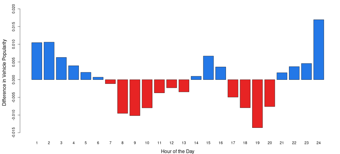
For instance, traditional bikes appear to be more popular than e-bikes during typical commuting hours (e.g., 8-9 am and 4-6 pm) where as e-bike usage appears to see greater popularity outside of these times with the highest peaks late at night or early in the morning. While this is based on a limited amount of data (2 weeks), it does demonstrate similarities to some of our work comparing commercial e-scooters (e.g., Lime) and e-bikes (e.g., Jump). Temporal patterns can also be indicative of activity behaviour. Given the commuting patterns exhibited by traditional bikes, one could reasonably assume that traditional bikes are more likely to be used to get to and from work where as e-bikes are more popular for recreational or non-work related trips. These are assumptions, however, and require further analysis. Next up for us will be some preliminary spatial analysis to explore clustering behaviour and differences between these two vehicle types.
To summarize, this post is meant to provide a brief overview of some preliminary data exploration and analysis that we have been doing on micromobility services in our own backyard (Montreal). This is really just a first step to demonstrate what is possible with available datasets. We hope to build out on this idea in the future.